Mindmaps

To view my Asset Moodboard: https://uk.pinterest.com/conorrabone/asset-moodboard/
Here is a quick show of what you will find in my Asset Moodboard and a better look into what interested me about some of these pictures. The thing that interested me most in Assets was Healing Items which I will talk about in more length later, this portion is a look into other ideas I had.
3D Steampunk Magic Thingy by Davison Carvalho

I like the look of this and also the multitude of things this asset could be incorporated into. Is it a grenade which your character throw, a item that your character holds which gives him a certain power or a is it a precious object that is going to be stolen and needs to be protected. It is clearly something valuable because of the gold detailing, but the weathering and marks give me the feeling it is something more ancient. According to the artist the inspiration behind this asset were Lemarchand's boxes, Sci-fi modular gadgets and steampunk among other things.
You can look at more of this artists work at: https://www.artstation.com/artist/weeneeds
Heavy Space Tug "Gordon" by Paul Pepera

This model is interesting because of its intricacy, there are mechanical parts that look like they would move or have different functions. The model definitely looks modular with the thrusters and fins all look identical the only unique part is the center piece which is mostly obscured by the surrounding outer pieces, so maybe it is easier to model than I first thought. The textures also seem fairly simple as there isn't a whole lot of detail, like scratches or distinguishing marks.
You can look at more of this artists work at: https://www.artstation.com/artist/paulpepera
Whale Oil Dispenser by Eric Pira

I am fan of this asset because while the model seems fairly simple the texturing really brings it to life. The coulours used are fitting to the world of Dishonored 2, the dark red isn't made lighter by the gold as it would usually be because of the dullness of the gold. The textures make it look like it hasn't been looked after or cleaned, the metal has rusted and the colour has dulled which makes it seem to me that it has been left and not been repainted.
You can look at more of this artists work at: https://www.artstation.com/artist/eric_pira

To view my Character Moodboard:https://uk.pinterest.com/conorrabone/character-moodboard/
Here is a quick look at some of the things you will find in my Character Moodboard and a more in depth look into what interests me about these pieces of art.Janus by Frankie Perez

I found this piece interesting because of the detailing on the characters armour, which looks odd to me because I don't understand if it has rusted or some of the detailing has broken off or if the armour was designed that way. He looks like a robot because of the lack of eyes in the mask and that the cylinders on his shoulders look like ports for some kind of wire. Also the proportions of the character and if it is a robot then why would he be designed that way, is it to be imposing? or more comical? but is it is meant to be comical than why give him armour.
You can look at more of this artists work at: https://www.artstation.com/artist/frankieperez
Sandalphon, Angel of New Life by Peter Mohrbacher

I find this art interesting, as well as the rest of Mohrbacher's Angelarium series, because of the very strange forms the angels take. This angel or there are multiple of Sandalphon as the art suggests, take on the form of children yet there heads look more like a strange kind of flower. Also what are the origins of these Angels, why do new angels exist and why are they taking such strange forms. there postures suggest they lack interest or maybe they are even confused. I love this piece because of the questions it compels me to ask but also the lack of answers it provides leaving the artwork and characters included in it shrouded in mystery.
You can look at more of this artists work at: https://www.artstation.com/artist/bugmeyer
Character Sketches by Hue Teo

I find these characters interesting for multiple reasons one being what they are wearing, they seem to all be wearing serape's which are usually worn by Latin Americans because of the heat they live in. They all have very clear attitudes, left being a comedian, middle seems more serious and right being more wise/intelligent, I feel this mostly because of their postures and what they are doing.
You can find more of Teo's work at: https://www.artstation.com/artist/htartist

To view my Environment Moodboard: https://uk.pinterest.com/conorrabone/environment-moodboard/
Barntown by Jennifer Wuestling

I find this to be an interesting environment because of how the artist has made one building that has the exact same style and look repeated over and over again looking interesting and not made it seem repetitive or boring. I also like that the people in the piece are all silhouettes so that they don't retract from the environment. You can also see that all of the lines in the image point to the large central barn, this is a good representation of traditional art composition.
The Tourists by Vincent Joyal

This city seems very intimidating and also incredible. The large domed buildings reaching into the sky in the background that feels like they are looming over the characters in the foreground but also look like they could be amazing to explore. You can also get a hint that the city sprawls from the smaller building in the background to the left. When you look at the smaller and, I assume, poorer settlement to the left it feels that there is a large financial gap between the two communities and that gives the beautiful city a bit more of a tainted feel.
You can find more of Joyal's work at: https://www.artstation.com/artist/joyal
After looking at my Mindmaps and Moodboards I wanted to have a closer look Into some of my ideas. I decided to break some of my favourite ideas down into their own mindmaps and analyse them more thoroughly.

To view my Overwatch Moodboard: https://uk.pinterest.com/conorrabone/overwatch/
These are some of the pictures from my moodboard to show what I was considering:
Hero Assets


Environments


Assets


These are some of the pictures from my moodboard to show what I was considering:


These are some of the pictures from my moodboard to show what I was considering:
Horror


Inspiration From Objects
Rotary Phone


Sketches


Lantern


The 2 Ideas I considered most were the Overwatch style Hero Asset or Hallway. To make a more informed decision I decided to look into both a bit more and draw some more in depth ideas for Overwatch.
Overwatch Hero Asset
The first thing I decided to look at to get a better idea for want I might want to create as an overwatch asset was other fan made assets.
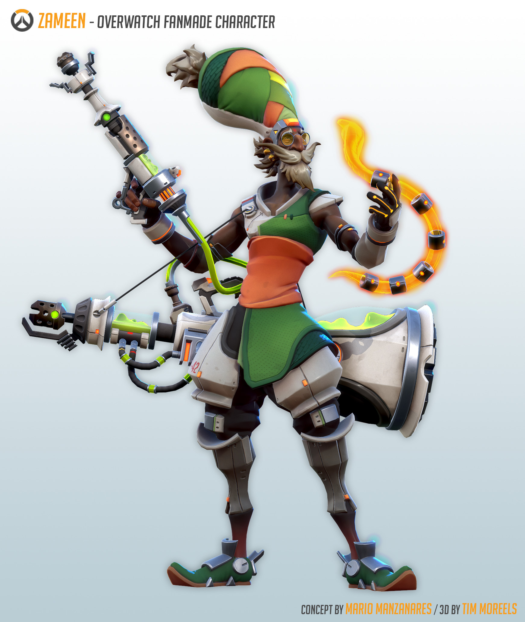
Zameen
Zameen is a fan character created by Mario Manzanares and Tim Moreels. "Zameen is a Techno-Biologist, nomad inventor, worldwide known for his peculiar ideas about the relation between humans and technology. Once the Omni Wars started, he started operating outlaw and experimented with the junk and technological waste of the conflict. Both his poisonous weapon and the mechanical-snake that Zameen uses in combat are product of this research." says Mario Manzanares on his artstation post. So it doesn't seem like much is known about this character and while this seems to fit his background adn personality that is being described it surprises me that so little is known about him seeing as he is "worldwide known" and has apparently released a book that seems to be well known.
Design Process
Mario started by sketching his ideas for the character. Him and tim ended up loving the final drawing so they used that going forward. I personally agree that the final is the best though I would love to see more done with the first concept. The final piece fits best with Overwatch's style and is I feel simple enough not to be overwhelming unlike the others.


They then started working on designing Zameen's weapon. Manzanares decided to follow the snake theme and made Zameen a poison based hero. Looking at the work here you can see how Manzanares is referring to already existing assets within the game and also looked at other existing objects. In the end the weapon ended up to be a canon that shoots poison that is based on a shisha pipe.

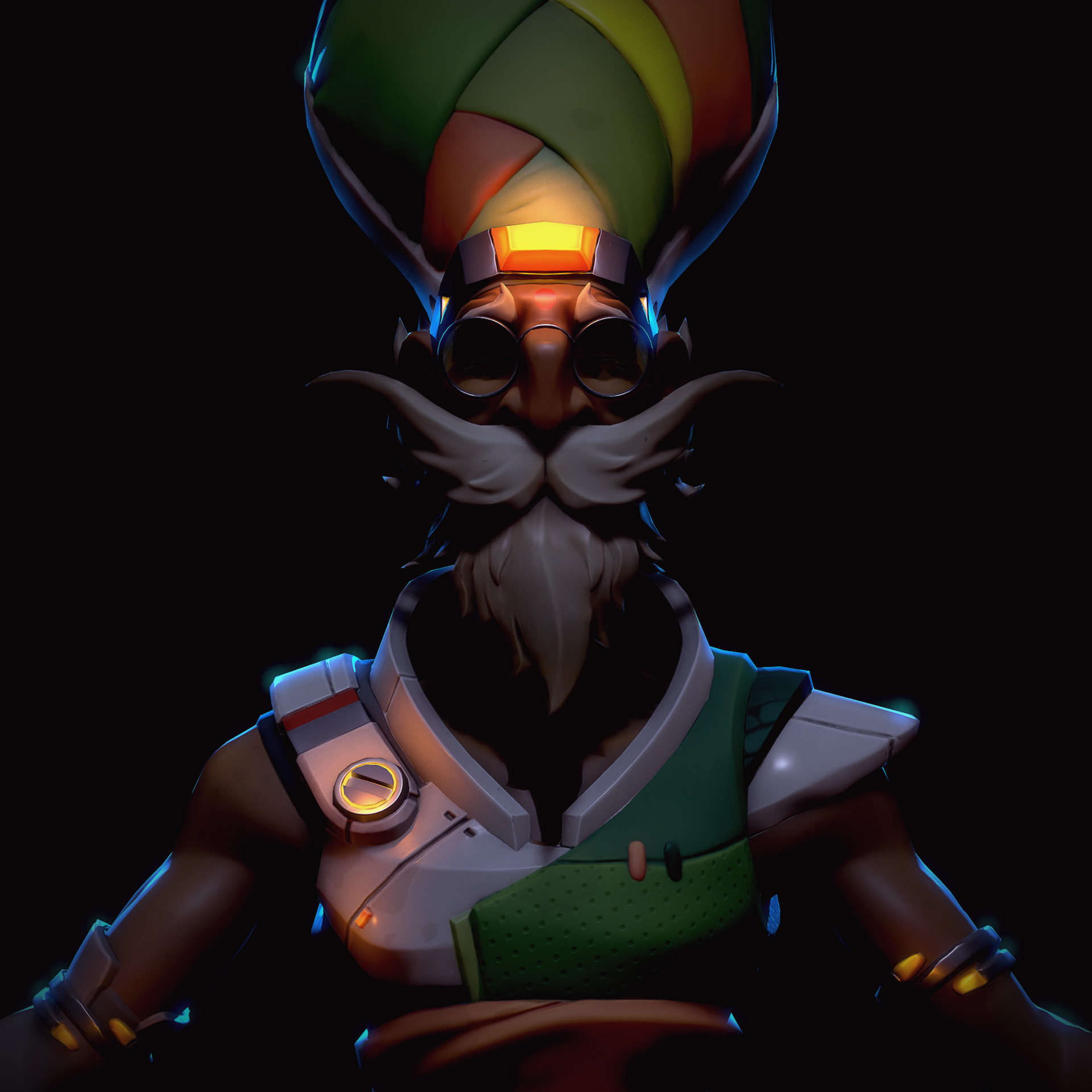
Final design of Zameen. Here you can get a really good feel for the character and see that his weapon fits his character design really well.

This is the final concept of Zameen after being modelled and textured. I think he is an extremely interesting character and that he fits well into Overwatch's art style.

They then created Promo art and an ability set for the character, which gives the work a more realistic feel for Overwatch's character development cycle. I appreciate how accurate the abilities sheet looks to Overwatch's actual abilities information layout.

Moreels has since done work for blizzard on Overwatch skins for the latest event. Namely Torbjorn's Chief Engineer Lindholm and Ironclad Torbjorn skins.

Moreels Artstation: https://www.artstation.com/artist/timmoreels
Manzanares Artstation: https://www.artstation.com/artist/mariomanzanares
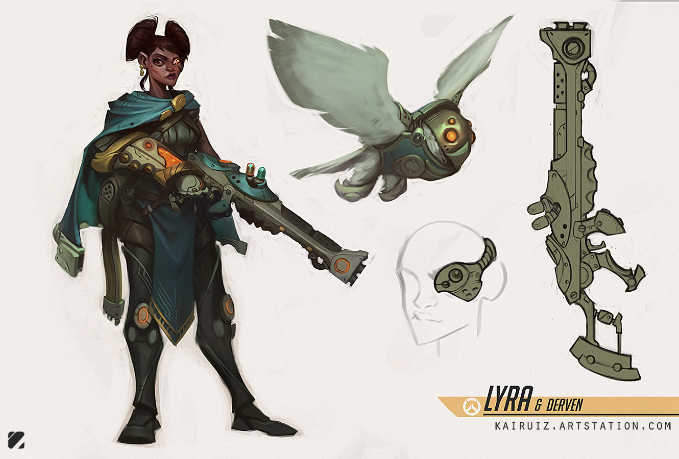
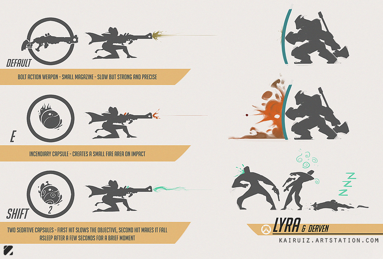
Lyra & Derven
Lyra and Derven are a character pair made by Carlos Ruiz. She is designed to be a counter to characters with larger health pools, such as Reinhardt and Roadhog. She has a Bolt action rifle, Incendiary grenades and Sedative capsules. Derven has Multiple explosives he can drop. I don't feel this characters art style and colour palette would fit into overwatch as they aren't very vibrant and look a bit flat, whereas Overwatch has a very bright look that feels like it pops. Her design is still very interesting and her abilities would fit comfortably in the game, I feel like she needs a little bit of tweaking to work as a final concept for Overwatch.

In-Game Hero Assets


These are all unique hero assets that are in overwatch (that aren't weapons) and as you can see they are all very simple in design, meant to take up very little amount of polygons but still be recognisable for what they are and one thing I think really helps with helping the player identify what they are is the colour and light they emit. Such as if it is a purple beam going upwards it will be Sombra's Translocator. The problem I had with this idea going forward were that I didn't think just one asset would be good enough for my final project and I didn't feel that I had enough strong ideas to create multiple to the quality standard that I had set for myself in this project.
Sketches

I think that the Smoke Grenade and X-ray Goggles are self explanatory but less so with the Boombox, Jump Pad and Hook. so the Boombox slows enemies down in a cone in front of it, to counteract enemies who have speed based abilities. The Jump Pad moves allies who step on it into the air and towards the direction it is pointed, it is a good way to give your allies the high ground and to close in on enemies who are using high ground. The Hook can grab health packs and certain enemies own objects that they place down such as Junkrat's Trap and Sombra's Translocator. I don't feel that I like any of these ideas enough for me to proceed through the project with, which is a little disappointing as I would have liked to create something to do with overwatch but I feel like my other idea is something that will be really special.
Hallway
The idea of creating hallway is really interesting to me because there are so many games with hallway's but I don't feel like anyone really pays attention to them. So when I played P.T which was a Hideo Kojima game that was going to be a reboot of the famous Silent Hill games, I was really surprised to find out that the whole demo revolved around one hallway, that was made to be very interesting environment even though you see it so often.
Hallways In Games


P.T. by Kojima Productions
As you can see the game has a very realistic style to it, something that really adds to the tension and horror theme of the game. This house look normal while you know as a player while walking through it that it doesn't feel right, you constantly feel on edge, like something is going to be around the corner in front of you or maybe just behind you. One thing I think really makes you feel that way is not only how dark the house is but how there are lights throughout the house that look really bright but it feels that their light makes no difference in the house. Another thing is the tightness of the hallway makes the house feel claustrophobic in its size.


The Last of Us by Naughty Dog
Here you can see that the artstyle is completely different to P.T, this artstyle is much more stylistic look to the environments. There is also a lot more happening in these environments and it doesn't feels as intimidating, it feels like less of a horror aesthetic and more like a action and post apocalyptic, because of the enemies with guns and the objects that look like cover. Also you can see the books and paper strewn across the ground and destroyed parts of the building.


Deus Ex: Mankind Divided by Eidos Montréal
Here you can see the bright colours and the excessive lights in the first picture. In the second picture the lighting is bright and inviting even though the environment is a sewer. These environments seem more grandiose and warm than intimidating. The first image makes me want to follow the hallway because of the lights on the ceiling leading me that way and because of the leading lines taking me there similar to the P.T hallway but i feel excited to run down there instead of the trepidation I feel from the P.T hallway.
Here are some very clearly different environments that if you ask me look absolutely stunning. I think that P.T.'s looks the best and it is what I want to take into consideration as I progress in the project going forward.

My initial sketch of my hallway is very basic but that is because a lot of my hallway's detail is in colour and this is just to give a quick idea of how my hallway looks. I think this would be really interesting to explore because I have never really concentrated on real life environments or assets, I have always focused on fantasy, so I'm excited to try something that I believe I would be good at.
My goal for this Project is to create a fully modelled and textured replication of my hallway at home. I will also create a high quality A2 promo art piece in Photoshop of the hallway. These need to be high quality and with full documentation of my process and the problems I will face for the duration of the project.
Project Proposal
Review
My main influence for the game was Resident Evil 7, it was
only recently released and the environment was really intriguing to me. This
made me look into different games and films with similar environments, most
notably was P.T a demo for the proposed sequel to Silent Hill.
I have created PBR textures in my first project which would
be helpful because I am planning on texturing the hallway using the PBR method.
I have also looked at 3D modelling environments in my Audience Project and in
my FMP last year. This will be helpful when applying different known
techniques, composition and lighting. Another thing that will help is the
colour theory and composition lessons I had to help give me a better idea of
the formal elements of art that will be influential on my project going
forward.
For this project I am hoping to develop my
writing skills and uploading to my blog on a timely fashion while keeping it
interesting to read. I am planning to focus on this as it will be good
experience for my university course.
Project Concept
I am
planning to model the section of my hallway closest to the front door at home.
I am going to fully texture it and import it into Unreal Engine, to present it
in a finished state. For the 2D side of my project I am going to produce multiple
contextual pieces for the background of my environment, such as newspaper
clippings, postcards and family pictures. I don’t know yet exactly how I am
going to present my backstory these are just some ideas I have had. I am also
going to create a 2D promotional art piece for my environment as a centre
piece. If I have more time I wish to model and texture my full hallway and make
it in a horror game setting.
The backstory is that my hallway is a part of a house that the family that lived there have been mysteriously disappeared. So this looks like the remnants of a house where the people living there have disappeared and they have left everything as it was. There will be letter’s lying around and other personal details. I have yet to decide what as i want to explore many options on how to present the backstory.
The biggest development I want to work on is my writing, in particular my annotations and evaluations. I also want to improve my texturing as I was really pleased with my PBR texturing in my materials project earlier this year and I feel like it could be improved upon this project.
The backstory is that my hallway is a part of a house that the family that lived there have been mysteriously disappeared. So this looks like the remnants of a house where the people living there have disappeared and they have left everything as it was. There will be letter’s lying around and other personal details. I have yet to decide what as i want to explore many options on how to present the backstory.
It will be a first person horror game,
so it will have to be highly detailed, this is why I feel that PBR texturing
will be best as it fits the style of the genre and allows for higher detailed
materials.
I am planning on using Maya to model
and Unreal to present my work or texture if I am unable to learn and use
Substance Painter in for the end of the project. I want to explore texturing
using Substance Painter for texturing because I feel that it will improve my
workflow and give me a better quality finish on my work.
The biggest development I want to work on is my writing, in particular my annotations and evaluations. I also want to improve my texturing as I was really pleased with my PBR texturing in my materials project earlier this year and I feel like it could be improved upon this project.
I will be consistently checking through my work and looking back at my proposal to make sure that I have kept with the plan I had set for the project, I will make this easier by keeping up with my blog. I will screenshot, capture video, and annotate my work to show my development of ideas and my work process. Video capture will help show my problem solving and I plan to talk more in depth about it.
Time Plan
Week 1 - 27/02/2017 - Mind Maps and MoodboardsWeek 2 - 06/03/2017 - Project Proposal and Research
Week 3 - 13/03/2017 - Research and Sketching
Week 4 - 20/03/2017 - Research and Sketching
Week 5 - 27/03/2017 - Modelling and Backstory Building
Week 6 - 03/04/2017 - Modelling and Backstory Building
Week 7 - 10/04/2017 - Modelling and Concept Art
Week 8 - 17/04/2017 - Modelling and Promo Art
Week 9 - 24/04/2017 - Texturing and Promo Art
Week 10 - 01/05/2017 - Texturing and Promo Art
Week 11 - 08/05/2017 - Texturing and Promo Art
Week 12 - 15/05/2017 - Importing to Unreal
Week 13 - 22/05/2017 - Evaluation and Blog
Plan Review
Week 1 -I have finished my Mindmaps and my Moodboards will be on going through the whole of the project because they are easy to update on Pinterest and it will be beneficial to continuously look for inspiration.
Week 2 - My Project Proposal took up most of my week and therefore I did't get much research done I may take some modelling time from week 5 to research.
Week 3 & 4 - Research has gone well for the last 2 weeks and I have a lot of reference to look back on, unfortunately my sketching and 2D work suffered because of this.
Week 5 - I have blocked out my model and done a test run to get an idea of how long modelling will take. I have caught up with some of my sketching but I haven't been working on backstory as much.
Week 6 - I have been focused on 2D work this week , completing my sketches and backstory, but I haven't been modelling.
Week 7 - I have created my orthographic's and started modelling completing all walls, the skirting board and some of the other assets. No Concept art has been done but I am working on iteration sheets, I will complete my Concept in Week 8. I feel comfortable that I will get Modelling finished by the end of Week 8.
Writing this now it is 17th of April and I realised that I am at least 2 weeks behind my plan. This means that in the coming weeks I will need to work twice as hard to get my project finished and even harder to get it finished to an acceptable level. I need to focus more on the practical elements of my work such as modelling and especially the 2D aspect of my work that I have neglected so far.
Target Audience
The target Audience for my game will be 16+ year olds, predominantly male players. This game will aim for older gamers who grew up on older horror games such as the original resident evil.
Interior Environment In Games
This is where I will be researching different Environments in games because I couldn't find anything on Hallways in particular, I decided to broaden the search to Interior Environments.
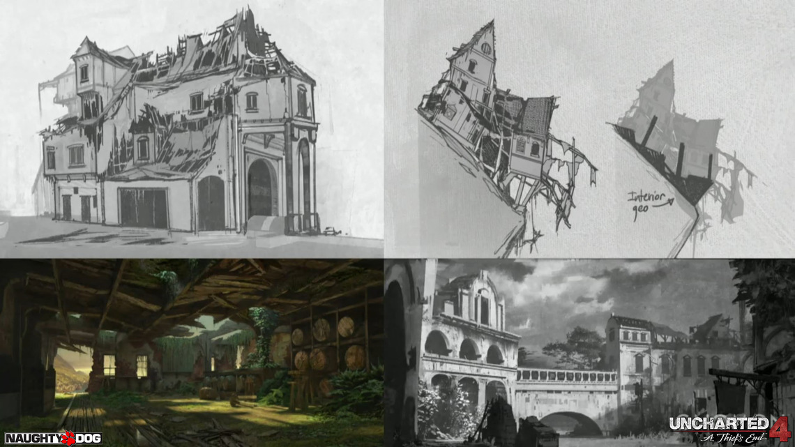
This is the concept art created for the city by Aaron Limonick it shows the the evolution of the concept. This is needed to give the modellers a clearer idea of the look they are trying to accomplish and also giving more context to the level as a whole so that the modellers and texturers can be more aware of what they will be working on.

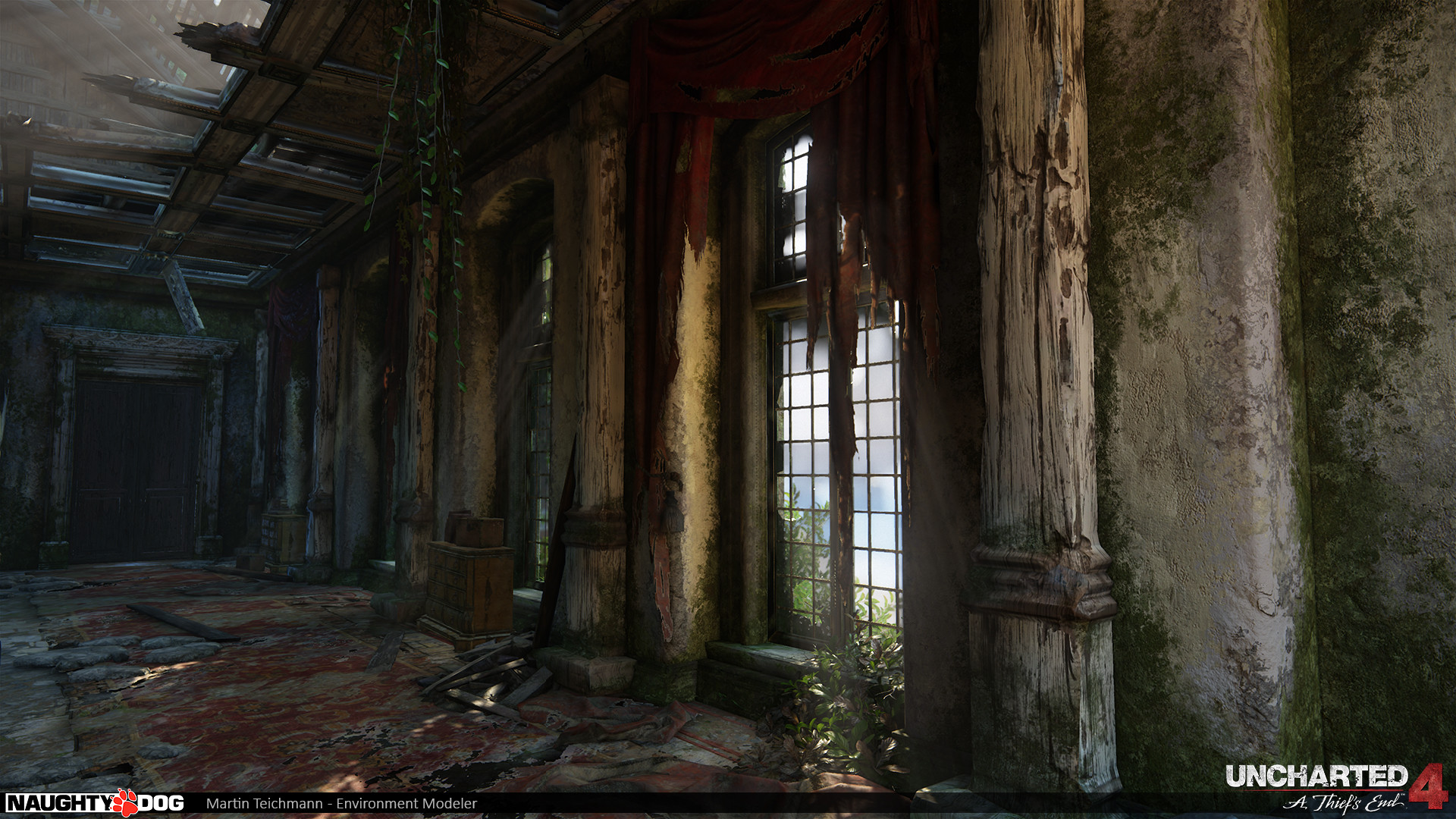
Uncharted 4
In this section I will be talking about the work process Naughty Dog during the making of Uncharted 4. I'm getting information from a talk that Martin Teichmann did for Gnomon where he talks about the making of a level that takes place in a abandoned pirate city.
This is the concept art created for the city by Aaron Limonick it shows the the evolution of the concept. This is needed to give the modellers a clearer idea of the look they are trying to accomplish and also giving more context to the level as a whole so that the modellers and texturers can be more aware of what they will be working on.
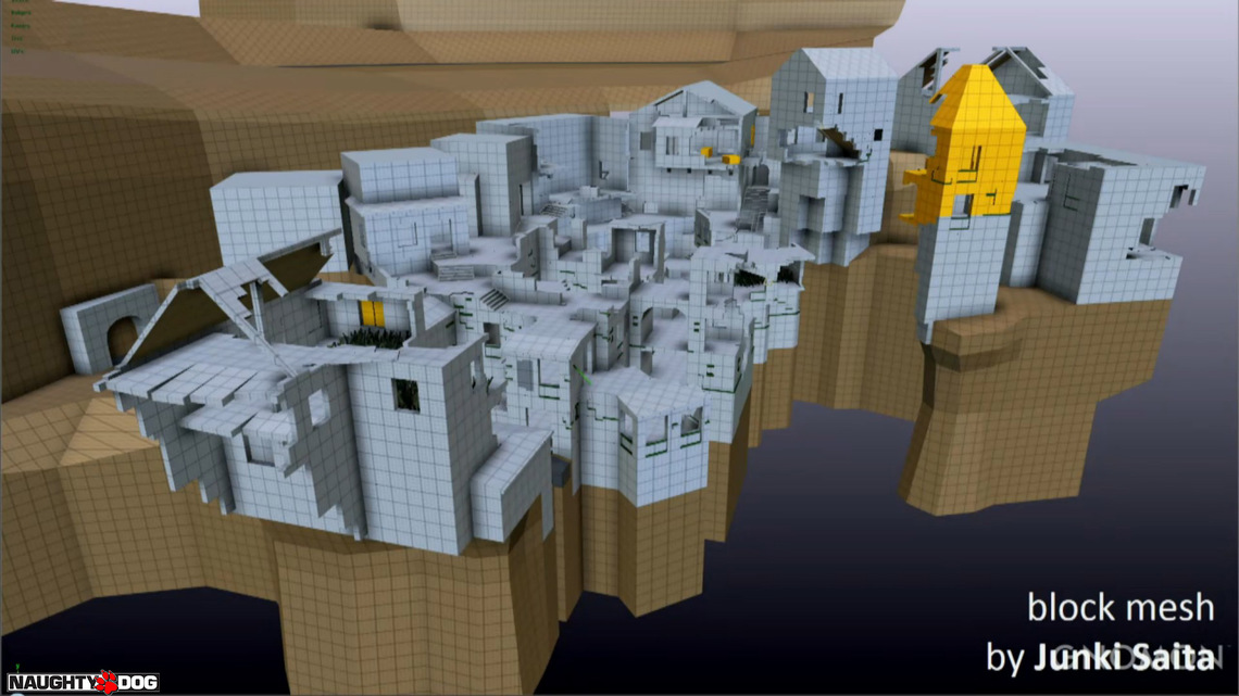
Once Naughty Dog had a clear idea on what the level would look like, Junki Saita a Level Designer at the company blocked out the models. It is very detailed, so all that is needed is to add a few extra details and texture it.
Now that Teichmann was modeling, they needed a better idea of the look and style of the level so he was sending his work in process to the Aaron Limonick for them to overpaint it. They would add more detail, refine the look and add which materials would be used for the final look.

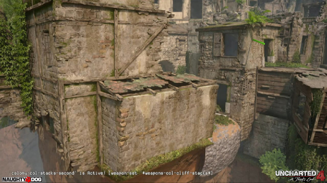
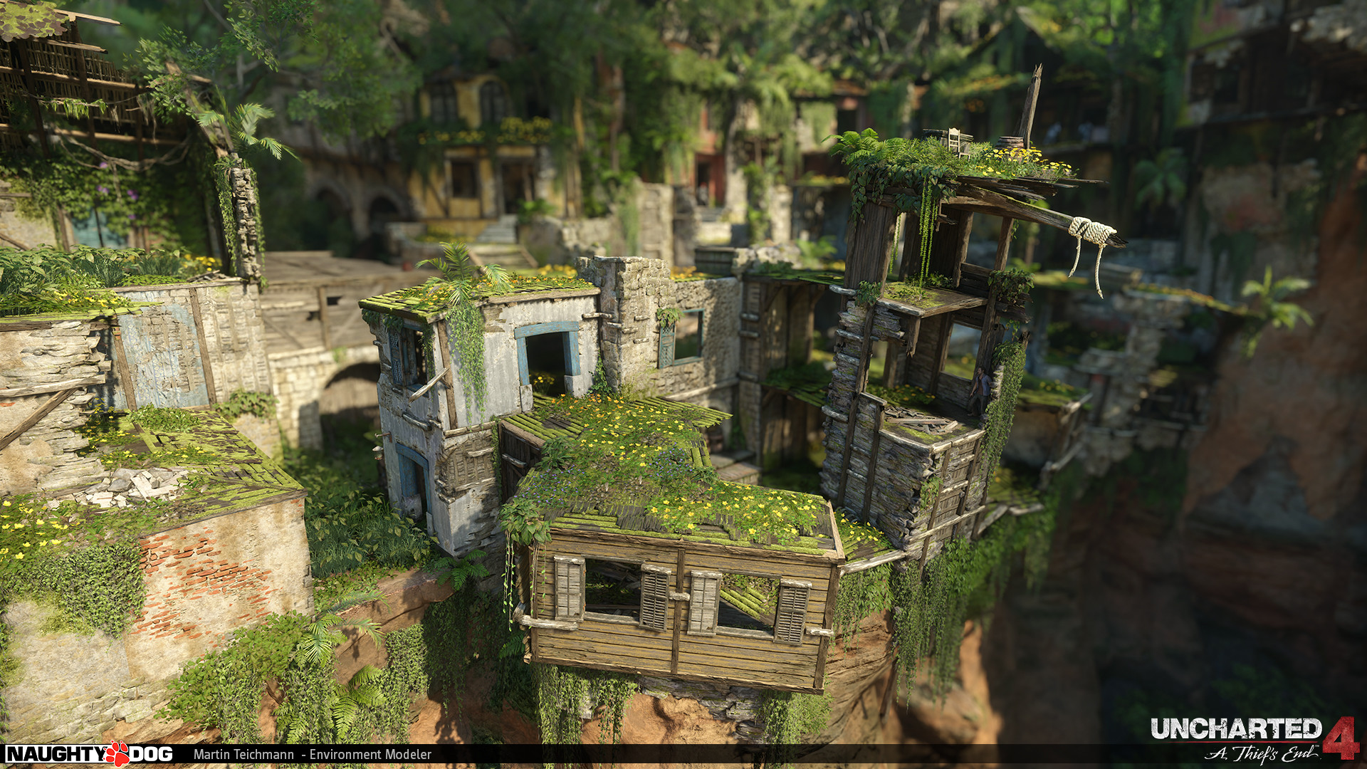
Next was texturing the level which Ana Cho did, she did a great job but unfortunately Teichmann didn't give much information on that but you can see the amount of detail and also how the texture helped give the city a much more ancient and destroyed feeling.
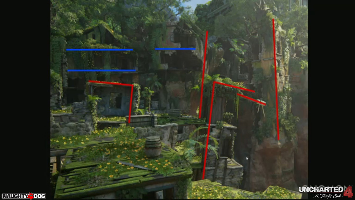
Now Teichmann talks about the challenges he faced in creating this level, the first challenge he mentions is how he can make the level more interesting and look more correct in the context of the level while keeping the mechanics of the game. In the game thsi area of the city is poor and has been slowly sliding down the hill but the model was originally very straight, this was to make the gameplay (shooting, jumping and climbing) easier for the player. So to make sense in context and to not break the mechanics Teichmann kept the center buildings straight while only slightly slanting the surrounding buildings, this gave the player the feeling that the environment was falling down a hill but he didn't slant it enough to brea the gameplay.

Another problem Teichmann discovored was that the surfaces that a player could use and move on wasnt clearly displayed. Because of the grey of the buildings it looked like it was all climable but only ceratain parts were to counteract this they did an overpaint of all the interactable surfaces and painted them a mossy green, so that the pplayer could know where he could move and never get stuck.
Now that Teichmann was modeling, they needed a better idea of the look and style of the level so he was sending his work in process to the Aaron Limonick for them to overpaint it. They would add more detail, refine the look and add which materials would be used for the final look.
Next was texturing the level which Ana Cho did, she did a great job but unfortunately Teichmann didn't give much information on that but you can see the amount of detail and also how the texture helped give the city a much more ancient and destroyed feeling.
Now Teichmann talks about the challenges he faced in creating this level, the first challenge he mentions is how he can make the level more interesting and look more correct in the context of the level while keeping the mechanics of the game. In the game thsi area of the city is poor and has been slowly sliding down the hill but the model was originally very straight, this was to make the gameplay (shooting, jumping and climbing) easier for the player. So to make sense in context and to not break the mechanics Teichmann kept the center buildings straight while only slightly slanting the surrounding buildings, this gave the player the feeling that the environment was falling down a hill but he didn't slant it enough to brea the gameplay.
Another problem Teichmann discovored was that the surfaces that a player could use and move on wasnt clearly displayed. Because of the grey of the buildings it looked like it was all climable but only ceratain parts were to counteract this they did an overpaint of all the interactable surfaces and painted them a mossy green, so that the pplayer could know where he could move and never get stuck.
Rainbow Six: Siege
I tried looking into Rainbow Six but there was very little information about it, I found some screenshots from the artists who worked on it but there was no breakdowns or information on their process.
Photo References
Moseley Road Swimming Baths


This is the hallway in the staff room of Moseley Road Swimming Baths. I find the


Home


Texture References


Backstory Research
I decided that if I wanted to make a good backstory for my environment I would need to look into both the hallway itself and how other games have built there backstories. I decided to first look at how other games and artists have built there backstories.
Spectrum Shifters
I happened upon an Artstation page for Jesse Li who has previously worked on League of Legends for Riot Games and Tinertia for Candescent Games. They have a private project done for school called Spectrum Shifters. Spectrum Shifters is a 2D Fighting game and Li published a 100 page PDF file recounting his time developing characters and stages for the game. He also goes into detail about the backstory of the game, including characters and stages.


Though I find the backstory to his characters boring and not very original, I still find them to be rather straight forward and that is perfect for a fighting game that I imagine will not have much of a focus on story elements. I would like for my backstory to me more in depth and interesting than Li's but I feel that the artist has a good foundation to build upon.
You can find more work and the link for the PDF at: https://www.artstation.com/artist/liyart
League of Legends
I am a big fan of how League of Legends present their backstory and the depth and detail they go into. They have a site called Universe of League of Legends where they tell short stories, show character and environment bios and show art of the different characters and environments. This makes the game feel more alive and allows you to connect with the characters more. This is a huge uptake seeing as though there are 136 different playable characters in League of Legends, reading through all of the information on this site would take days, so you can see that this is an extremely comprehensive way of giving backstory to your game.
Here is some of the art shown on the site.


This is the information on a champion called Bard and you can see that he doesn't have much information to talk about and maybe Riot Games will be revisiting him and talking more about his background.

But in contrast Camille has much more information in her bio almost a short story that you can find here:http://universe.leagueoflegends.com/en_GB/story/champion/camille/ As you can see this is a more extensive look at her character and even her family. It talks about her ancestry and how this has affected her life. It goes into great depth about her personality, upbringing and the troubles she faced later in life. i think Riot's backstory building is one of the best I have ever seen in video games and it is a great influence and motivation for me.
Backstory
The backstory behind my hallway is that there is a normal British house built in the 1930’s and the family that live there has mysteriously disappeared. A detective shows up and gets trapped in the house, He has to go through terrifying tasks to find what has happened. The house seems to be haunted by something, it affects how you perceive the environment, sometimes looks larger or stretched. It feels like you are viewing the whole experience in a house of mirrors. As you search the house you will find different notes left by the family talking about the strange things that happen and the changes that lead to their disappearance.
Maya Experimentation
I didn't have any reference photos at the start of the day so I thought I would get a picture form the internet of a hallway to at least get an idea of how to model a hallway. I didn't get very far because I got reference images of my hallway from home so I moved onto modelling my hallway. One thing trying to model from an image on the internet taught me was that I need to get good reference images to work from as I ended up doing a lot of guessing that didn't really help the process as much as it made it harder.

Modelling Research
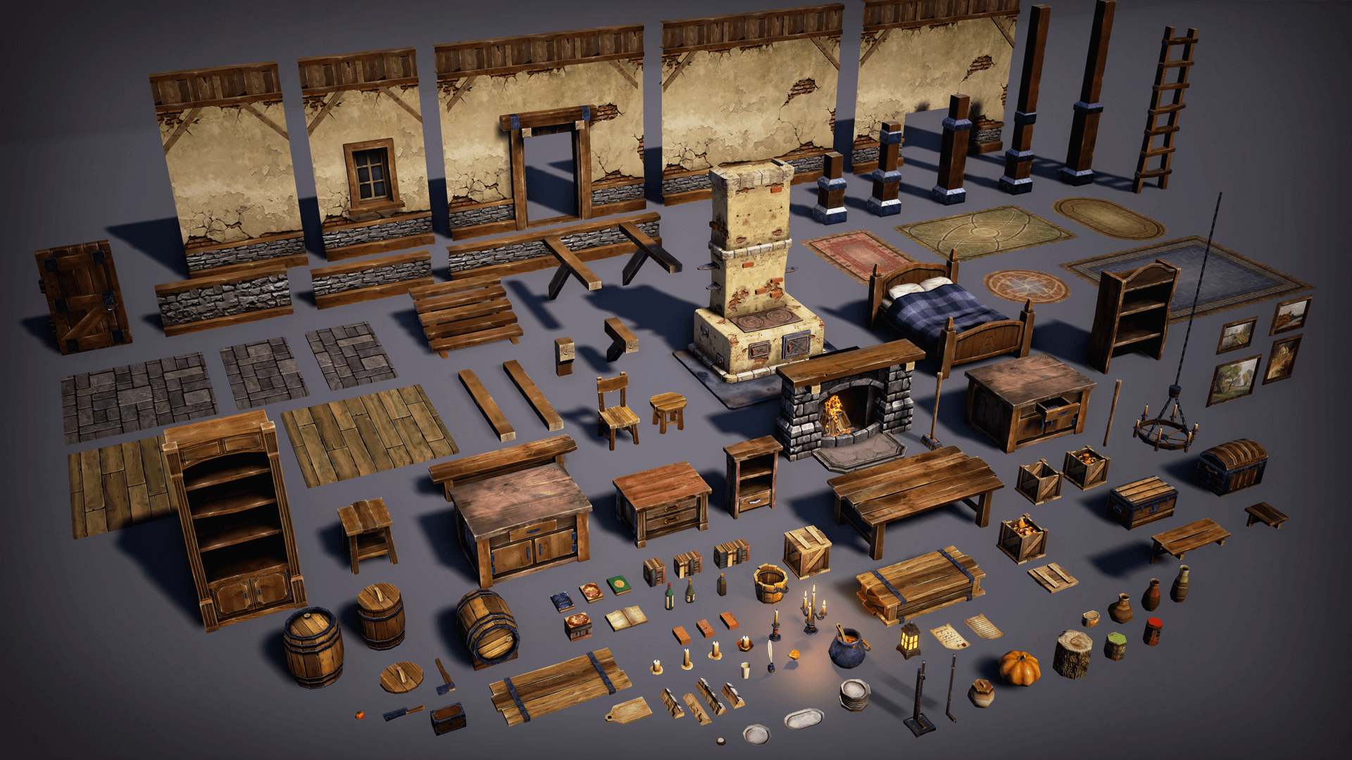
Modular Modelling is a modelling technique where you model
certain unique assets and repeat them to create a whole environment. So a
doorway, a wall and a window assets would create one side of a building and you
would repeat them to make all walks in the building.
This is a well known and frequently used technique because
if used correctly it will greatly speed up the modelling process as well as not
being easy to discover that a game is using this technique because of the
unique details you would add to the assets to make them all different.
This technique could be beneficial for me as I would only
need to model one part of my wall to do the whole wall which would save a lot
of time for me because modelling a section means I've modelled a large portion
of my scene.
One thing to be mind full of this technique is it needs a
lot of forward thinking and planning because if I get one piece wrong I have a
whole securing of my model wrong. So this can be daunting but I would just need
to have careful planning.
Here you can see that the artist, Victor Kudryashov, has broken down his whole scene into unique parts so that he can build the whole scene from just these smaller models. I intend to use this technique because it will make my work quicker and easier because instead of modelling the whole hallway I can break it down and only model what I need so that I don't repeat myself.
Here you can see that the artist, Victor Kudryashov, has broken down his whole scene into unique parts so that he can build the whole scene from just these smaller models. I intend to use this technique because it will make my work quicker and easier because instead of modelling the whole hallway I can break it down and only model what I need so that I don't repeat myself.
Using the models created in the picture above Kudryashov has created a top down fantasy interior, from these shots you can see how intricate some of the environments you can make using this technique. It would also be quicker to model the unique pieces than the entire environment, as it is quite large.
I recently listened to a talk on building environments by Helder Pinto at the Gnomon Academy. One thing that Pinto stressed was that if you are going to create a modular environment you should avoid Hero props (unique models) as much as possible because they are the biggest time sink and while they are important you need to concentrate on the modular parts of the environment more because they are what the player will see more of. He also stated that giving yourself limits on what you are planning to accomplish is important because you want to make sure you can complete the project in time and it makes sure that you don't get ahead of yourself. Pinto also mentioned how as a designer creating modular environments because if you model to the grid all of the pieces will be the correct size so that they can snap in place and stay neat. His process was to block out the environment and iterate on it, after the iteration see if there needs to be Hero props and if so you should keep it an a minimal amount or it will take up a lot of time to model them, as stated above. Pinto states that the few Hero props should have an extra level of detail because you can't add such detail to the modular aspects of the model, so to make the scene feel more alive you add that detail to Hero props.
Paraphrasing Credit Needed

Sub-division Modelling is a modelling technique where you add the level of sub-divisions in a model to make it a higher poly mesh to make it more detailed and cleaner looking. One of the most important techniques is using supporting edge loops to keep the shape and definition you would like. I'm not sure how helpful this will be to me but I intend to experiment just to see the effects and if it will improve my overall model.

Trim Textures are where only the V side of a UV so that it tiles horizontally but not vertically, this is especially good for walls because walls don't usually get taller so you don't need to worry about tiling it vertically.

Artist Research
3D Artists
Joy Lea
Lea works for DICE LA currently working on Battlefield 1 as a prop artist and texture artist. She has previously worked on Batllefield 4 and on ADR1FT by ThreeZeroOne. She mainly works on hero props. Her main software seems to be Maya and Quixel, though she does use Marvelous Designer and Zbrush. I hadn't considered using Marvelous but after looking at what she had accomplished with it I am planning on looking into it more. I also would like to have a closer look at Quixel and Zbrush as it can produce good looking work.


You can see more of this artists work at: https://www.artstation.com/artist/joylea
Helder Pinto
Pinto is a Environment artist that currently works for Blizzard on Overwatch, before that he worked on Crysis 2 and 3 for Crytek. He is mainly an environment artist that specialises in modular environments, he did a talk that breaks down his process for making environment on Gnomon called 3D Environment Art for Games. There isn't much information on what software he uses except for knowing Unreal Engine, but seeing as though Maya is the premiere modelling software I can assume that he uses it.
These images are on Pinto's portfolio but they were created by multiple people in a team so it is hard to see what of this he did. Though I can infer that it was probably the modular aspects of the scenes, such as walls and floors.


You can see more of this artists work at: http://www.helderpinto.com
Martin Teichmann
Teichmann currently works for Naughty Dog as an Environment Artist. He worked on Uncharted 4, Batman: Arkham Knight for Rocksteady Studios and on Crysis 3 for Crytek. When working on Uncharted 4 his main body of work was an old abandoned Pirate city later on in the game. I wrote about his work on that city and also Naughty Dog's process earlier on in my blog. Teichmann seems to only use Maya as he doesn't texture, all he does is model.
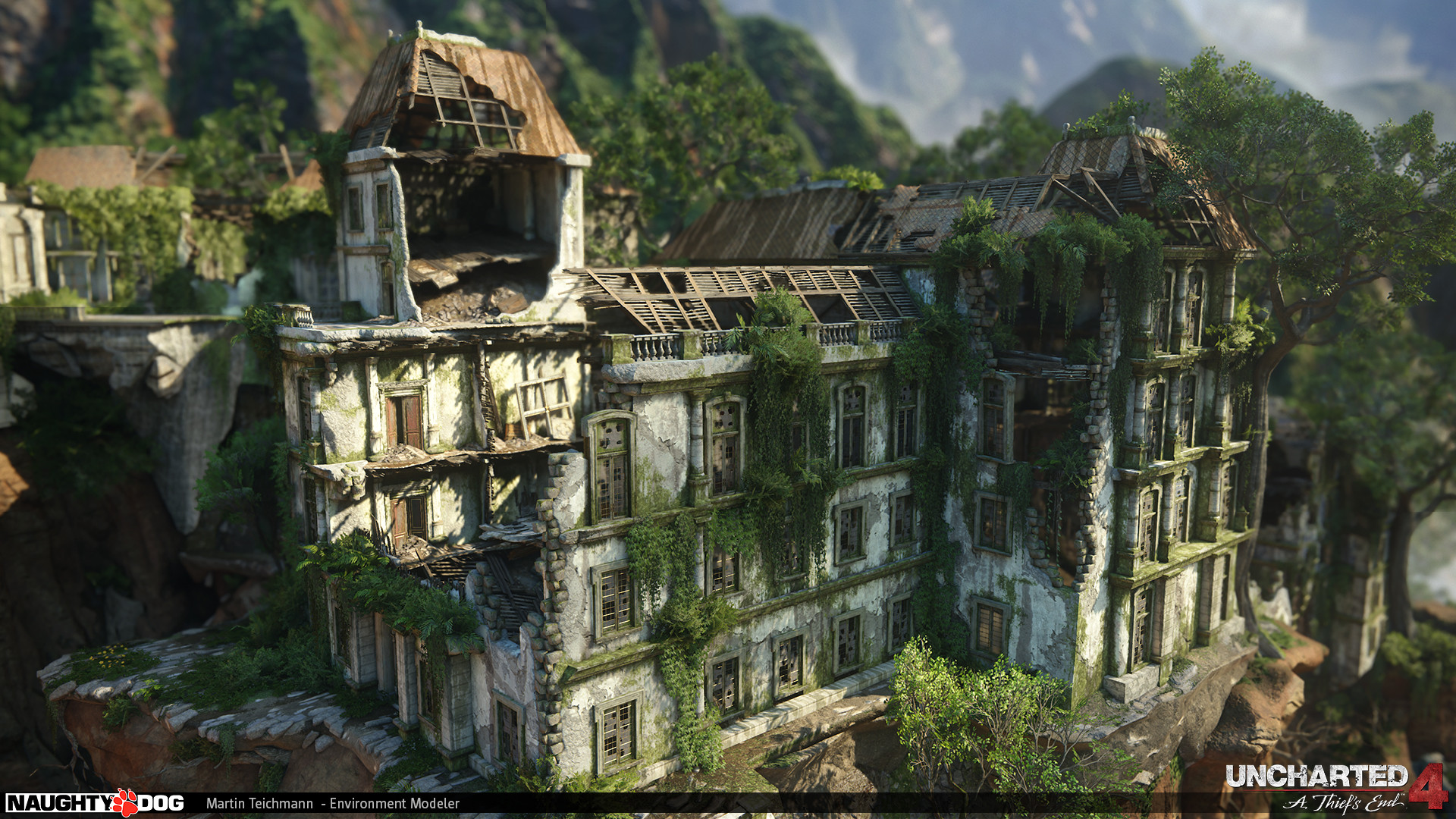
Here are some of his work on Uncharted 4, He worked on a team on this project so it's harder to distinguish what is his work. I know he did none of the texturing, only modelling but I believe he only worked on the finer details, seeing as though he spoke about other artists blocking out.
You can see more of this artists work at: https://www.artstation.com/artist/mayday
Said Zamzad
Zamzad has worked in the games industry since 2010 starting as a weopon/prop artist for Easy Studios working on Battlefield Play4free and Battlefield Heroes. In 2016 he was working with Dice on Mirrors Edge Catalyst as an environment artist. He is experienced using many software packages including Maya, Substance and Unreal Engine.
Here is some of his work on Mirrors Edge Catalyst, he worked in a team so its hard to know what piece is his work and not someone else's. The art is phenomenal, I love the attention to detail and use of one colour with the black and white to really bring the environment to life while keeping it looking clean and simplistic.


You can see more of this artists work at: https://www.artstation.com/artist/diwan
2D Artists
Gregory Crewdson
I feel like the biggest takeaway of Crewdson's photography for me is the striking vulnerability of the people and the way his photo's capture that in different ways really intrigues me. In the first picture here, of the married couple, you can see how they are looking in opposite directions which shows how they are moving apart. The wife is all standing and further forward which gives her a larger presence in the photo almost as if she has more power in the relationship and you can also see that his bedside lamp is on which makes his side of the bed illuminated whereas her side is dark which i take to mean that he is still in love with her but she isn't. She is also standing close to the open door, like she wants to leave which could signify that she wants to leave the marriage as well. I like the use of colour in this as well the room is a somber blue that looks like it would usually be bright but is darker now, I can infer that they may be having a fight or disagreement. Overall I really feel like Crewdson can show a lot to the viewer with minimal touches and he is also a good reference on how to use lighting, colour and composition to tell a story.


Software Research
Substance Painter
Substance is a 3D texturing and rendering software. This is where you can modify textures and create new materials but unlike other texture software with this software you can paint the different materials onto the model. You can then layer different affects onto the other present materials without affecting the base material. so if you add rust or weathering onto the model the material wont be affected. This means you can have a more direct influence on your materials and in a much more detailed and controlled way.

Marvelous Designer
Marvelous is for 3D modelling clothing and fabrics. It is more used by character artists but environment artists are using it more now to accurately create things like curtains or furniture. I don't feel like it will be a helpful software for me because I don't have any Fabrics to create in my environment. It seems rather easy to use, you create them by generating UV's and choosing which material you want it to emulate and then just manipulate it to get the final look you want it to have.

Zbrush
Zbrush is a digital modelling and sculpting software. It is used more for sculpting, like Mudbox but with more features and functions. It is used more often in the games industry than Mudbox because it allows more control. It also can easily connect to Keyshot a premier rendering software. In the new software you can make different instances which you can make varying differences in detail while keeping your polycount the same as before. As you can see in the picture below the UI can be quite confusing and intimidating which is a drawback for the program.

Zbrush is a digital modelling and sculpting software. It is used more for sculpting, like Mudbox but with more features and functions. It is used more often in the games industry than Mudbox because it allows more control. It also can easily connect to Keyshot a premier rendering software. In the new software you can make different instances which you can make varying differences in detail while keeping your polycount the same as before. As you can see in the picture below the UI can be quite confusing and intimidating which is a drawback for the program.
Quixel
Quixel is a Photoshop plugin which makes you be able to scan and paint PBR textures in photoshop with the same tools you would usually use. This makes it easier for 2D artists who aren't used to texturing but can use Photoshop. They also promise a material library with over 1,000 materials. They also say they are the texturing tool used by most Games Developers in the industry. It is also relatively easy to import your textured model into Unity 5 or Unreal Engine 4.
Quixel is a Photoshop plugin which makes you be able to scan and paint PBR textures in photoshop with the same tools you would usually use. This makes it easier for 2D artists who aren't used to texturing but can use Photoshop. They also promise a material library with over 1,000 materials. They also say they are the texturing tool used by most Games Developers in the industry. It is also relatively easy to import your textured model into Unity 5 or Unreal Engine 4.

Portfolio Presentation
Artstation
Artstation is a major website for artists to exhibit their work, it is the most used website for exhibiting art. I feel like this website is the easiest and best way to show my work and get the most visibility as an artist. I already have an Artstation account set up and I already have work presented there, so I will present my work there as it is the website I have already put work into.

Deviantart
Deviantart is a website that is less professional than Artstation and is used more by the general public. I have no experience with Deviantart so if I choose to use it I will have to learn how to operate it and create an account. It will also be less beneficial to me as it will not be as visible to professional people and I feel Artstation has a better community for giving feedback and constructive criticism.
Backstory
The backstory behind my hallway is that there is a normal British house built in the 1930’s and the family that live there has mysteriously disappeared. A detective shows up and gets trapped in the house, He has to go through terrifying tasks to find what has happened. The house seems to be haunted by something, it affects how you perceive the environment, sometimes looks larger or stretched. It feels like you are viewing the whole experience in a house of mirrors. As you search the house you will find different notes left by the family talking about the strange things that happen and the changes that lead to their disappearance.
One of the first problems I encountered in this project was deciding what I was going to create. I solved this problem with extensive mind mapping and mood boarding, this gave me a clear feeling of what I was most interested in.
My second problem I faced was finding research on my chosen project because there was a surprising lack of video or articles talking about modelling hallways so I broadened my search to just interior modelling, this produced more helpful materials for me to look at.
One problem I faced while creating the blockout for my hallway was that I couldn't create an edge loop around my whole model this was because I didn't delete the edges on my model correctly. I pressed delete and I should have either pressed Ctrl + Delete or Shift + Right Click and selected delete edge, this would have deleted the edge and vertices.
Model Block Out
This is where I block out the model I want to create in low detail just to make sure I have an idea of the proportions and amount of detail I want to add. I started of bu generating square polygonal shapes and resizing them so that they were the correct dimensions in line with the six foot man that I had already imported into my scene. A problem I quickly discovered was that if I was going to have it in proportion to my six foot man the hallway would be very small, to combat this problem I scaled up my size of my hallway.
After scaling up my squarer model I imported it into Unreal and looked at teh size of it compared to the default Unreal character which isn't how i hoped it would look, I also thought that the square shapes made the model look larger than it was. I also discovered that I preferred to generate Planes and sculpt them than generating the squares as I felt it allowed me more control over the shape and it wasn't as large so I got a better look at the actual size my walls would be.
I discovered here that I had missed out a segment of my wall by accident so I had to research how to split up one mesh from the other I discovered the best way to do this was to select the faces I wanted to separate from the rest of the model and used the Extract tool which changed one mesh into two. this allowed me to extrude the edge of one model into the wall segment and then I just had to target weld tool the two meshes together.
2D Concept
I wasn't sure how I wanted my concept piece to look at first and then I realised that I didn't need to do one concept piece I could do multiple. So here is my concept pieces that I did for multiple assts that make up my environment


Personal Review

Reviewing is something I need to get into the habit of doing more as I find it can be very helpful to organise my thoughts and on going workflow. Looking at this review I realised how much I needed to do, there isn't much I've missed when researching but I need to start focusing more on practical elements more.
Modelling Break Down
Walls - Modelling 1:30 Hours - UV 30 Minutes -Texturing 1 Hour
Skirting Board - Modelling 30 Minutes - UV 1 Hour - Texturing 2 Hours

Door - Modelling 5 Hours -UV- 1 Hour - Texturing 1 Hour -This is my Hero Asset so I feel like I should take longer.
The door can be broken down into - Handle, Hinges, Window, Post Box, and Decorations.

Panic Button - Modelling 30 Minutes - UV 15 Minutes - Texturing 30 Minutes

Alarm - Modelling 30 Minutes - UV 30 Minutes - Texturing 2 Hours

Alcove - Modelling 15 Minutes - UV 15 Minutes - Texturing 45 Minutes

Plaque - Modelling 5 Minutes - UV 5 Minutes - Texturing

Key Hook - Modelling 1 Hour

Light Switch - Modelling 45 Minutes

Radiator - Modelling 30 Minutes

Plug Socket - Modelling 45 Minutes

Light - Modelling 30 Minutes

Heat Cover - Modelling 10 Minutes

Picture - Modelling 5 Minutes

Modelling
Unfortunately my recording software crashed when I was recording the modelling of my first piece so i will have to explain what I did. So I began in a blank maya and created a plane, I then scaled it so it was narrow adn tall, as it was going to be my one piece of wall that I would then duplicate to create my whole wall. After that I extruded the bottom part and using the movement tall and edge loop I formed the bottom into a skirting board.
After creating my piece of wall I then duplicated it and held down "X" when moving my next piece so that it would stay on the grid lines and match up with my remaining piece. Then I combined the pieces and used the target weld tool to weld together the different pieces of wall.
I then went on to block out my model. Carrying on with the wall connection between the left wall and front wall, then onto the front wall and door and finished of with the right wall. The door was hard to create and I should have created orthographics earlier in the modelling process but I didn't think of creating them. I have now created orthographics and they are making the modelling process a lot easier. A problem I faced was lining up my orthographics but I have gotten it correct. Unfortunately I have no record of making my orthographics because of crashes with my recording software.
I measured my hallway and all of the individual assets that I will need to model, This took longer than I expected and it wasn't something I had accounted for in my plan so modelling will take longer than I originally planned, this may be a problem but it just means I may have less time for texturing but I did purposefully leave the last week free of everything but evaluation which won't take long to complete.


After importing my orthographics I finished blocking out my model, this was useful so that I had a good idea of the size of my model and a good base for me to add detail. It was also helpful so that I could render the model and paint over it for my Concept art and also it allowed me to create my Silhouettes which I will go into more detail at another point. I found blocking out my model quite easy, the biggest problem I found was getting everything lined up correctly but my orthographics really helped that process. I feel like my model is at a good point and it shouldn't be too difficult to add detail, Blocking out looks like it was the hardest part for me because I struggle when I have nothing to go off of but now that I have a strong base and have built up momentum I think it will carry me through the rest of the modelling and texturing phase.
Ambient Occlusion Render
I set up my Ambient Occlusion in Hypershade and I used live view through Arnold Renderer to see how it would look. After looking at it I noticed that with the settings I had the Render couldn't be as detailed as I would like, my tutor showed me what options to change to make it darker and more detailed. the options I changed were Samples which I upped from 3 to 4 and Far clip which I changed from 100 to 300 in Hypershade.


Silhouettes
Concept Art
This is a very rough and quick concept of what I am going to complete for my 3D Model, I painted over my blockout render using photoshop. This gives a clear indication of what I intend to create and it while it doesn't look that good I don't feel like that's important for this concept.

Light Iteration


Here you can see my Lighting iteration I am happy with the outcome and you can see how I got used to the new lighting system in Maya. Maya 2017 uses Arnold Renderer lighting, this means that if you want to render lighting you have to use Arnold lights, which is something new for both me and my tutors. This means that a lot of this lighting was experimentation and you can clearly see that after the first page of pictures I did some research on lighting in Arnold. My main resource for research was Solid Angle's Arnold tutorials. I feel like my scene may need to be lighter but seeing as though there isn't any textures I don't know how they will interact with my lighting so I will need to do more experiments after I have textured my model.
Colour Iteration


Even though I won't be using any of these colour palettes for my final piece as I want it to be as accurate to my hallway as possible I think it is important to experiment just in case there is something interesting enough that I would prefer it over my original concept and i do think that some of them are really interesting. Such as the ones with inverted colour which gave the hallway a darker look which adds to the horror theme but I wanted my hallway to rest less on the horror theme and more on the realistic look, as I feel that works better in a horror game because it makes you feel as if you could be the character you are playing as in this house. The monochromatic look was interesting but not as impactful as I would want, I feel that some parts meld together, such as the door whereas I want that to stand out and draw the player towards it.
Art Style Iteration
As you can see I have experimented with many different Art styles. I ended up settling on realistic but I really enjoyed experimenting and I felt that it helped me evolve my work and gave me a wider view on different styles. Cell shaded was a favourite of mine in these experiments as I felt that it had a really unique look and was closer to the art style I have previously used but overall I felt that realistic was a better fit for the environment and scene I wanted to create.
Cell Shaded

Cartoon

Monochrome/Noir

Realistic

Composition Iteration
Because I am modelling from real life I can't experiment with composition because my model needs to be in a fixed place and the assets need to be in a fixed place within the model.
Modelling
Picture frame
I faced a problem when modelling my Picture frame I couldn't insert an edge loop because it would add edges that weren't needed. I did some research on google and found out that sometimes the edge loop tool doesn't work with extruded faces because it can make the object unconnected. So in the end I had to use the multi cut tool.
I modelled the picture frame by cutting in edges with the Multi Cut tool to create the curve of the frame. At first I was going to make one side curve and then go around and do it side by side but then I realised that a much easier way to do it was to cut the edges over the whole of the frame and model them together so that the curvature was correct.
Light Switch
Modelling the light switch was really easy because the majority of the detail I am going to add will be in the texturing. All I had to do was round the edges of my model to make it look more realistic.
Key Hook
This was the original block out for my Key which was an extremely quick and easy model I put together. It was just an extruded cube and a cylinder that weren't even connected.

When it was time to model the Key actually I created an image plain and modelled it following the picture because of the detail of the key this meant that I didn't get any of the measurements. It wasn't hard to do it just took a surprising amount of time. A lot of the detail will be in the texturing portion of the model as with teh rest of my scene.

Radiator
I tried to find a tutorial for modelling radiators but it is blocked on the college network so this means that I cannot watch it and it needs to be modelled today. I will attempt to model it again and if I can't I will ask my tutor for help.
After multiple attempts at modelling the radiator myself I asked my tutor who in the end did a quick and basic model of the radiator and then baked a Normal map in Maya. This was an easier way of modelling my radiator with a lot less poly's because it is just an illusion of depth that the normal map gives this will be fine for my model as you will never really concentrate on the radiator in my scene.

Unreal Test

I imported my scene into Unreal Engine 4 and as you can see it looks really good the only change I need to make is to flip my ceiling in the model as it goes transparent on the wrong side. Other than that I feel that the scene as a whole looks really good so far.
Final Model


This is my finished model, I am very happy about how good this model turned out looking. It took a lot longer than I first expected it to take so I spent more time than I had initially wanted but I got it done early enough so that I have enough time for UVing and texturing. I feel like my modelling has improved quite a bit from my last project. I have learnt a lot about modelling in the last year that I feel really helped me get this scene at the quality it is at. I am also quite happy about the efficiency of the topology of my model, as you can see in the second picture. I feel like my modelling was made easier by the rather basic shapes that the majority of my assets have the hardest part was setting up my Uv's and getting my hallway in the correct composition. But because of the simplicity of a lot of my models, the majority was done during the blockout and then I only needed to tweak certain things.
Substance Painter
Due to hardware limitations I won't be able to use Substance Painter at home and we can't get it at college. Though this is unfortunate as I won't be able to get the experience of using it I think it could be good because of my time limitations that I can be comfortable when creating my Textures and materials in Photoshop and Unreal Engine.
UV


UVing was very difficult for me because i had forgotten how to UV from the last time I had done it and I don't think I've ever UVed something as part of a project. so I had to have help getting to grips with the process but after a quick walk through I felt that I settled in rather easily. It didn't take that long to UV, only a day and a half. I unfortunately forgot to record any of my progress, so there isn't much to show but the process is very similar from object to object. I used a planar UV and then cut the seams where I wanted them, unfolded the objects so that the 3D object turned into a 2D net. I ran into some problems such as overlapping faces or interior faces connecting two sides of a model these were easily rectified by deleting the offending faces and in some cases remodeling some edges.
Promo Art
When I started on my Promo Art I wasn't sure what my focus would be, in the end I decided to make it the door in my scene. As in my backstory the main objective is to escape the house. So I looked at my reference pictures that I took of the hallway and liked the look of this picture. I felt like the Light would make a good focal point and the way the picture slowly darkens as your eyes move away from the light would be a good look and convey the horror theme.

The first thing I did was to paint the base colours that would make up this painting. I decided that I wouldn't include certain things such as the pipes in my wall and the lock mechanism on my door, simply because it wasn't important to the painting and that they aren't in my 3D model because of time constraints.

I then concentrated on the which was easier for me seeing as though I had already painted it earlier on for my concept art. After completing the alarm I moved onto the Door handle, this was harder to paint as it was something I hadn't painted yet and it has a lot of small details on it that I found hard to capture in a way that showed up on the painting when further away. I feel like the handle seems a little bland and i would like to move back to it later. I also started on the wood flooring that includes a lot of detail, I am happy so far with the detail but I need to blend the colours more to give the floor a more realistic feeling to it.

I carried on with the floor but I wasn't very happy about how it was turning out so I decided to move on and come back to the flooring later. So instead I focused on the door itself as it is the most important part of the painting, I started by painting the outer indent of the doorway, I'm still not happy with the lack of blending but i feel like I mostly have the colours correct. I moved on to the door hinges and I am happy with the middle hinge but I feel the top one isn't visible enough and that the bottom one is too eye catching and takes away from the door itself which is supposed to be the main focus.

After concentrating on the door and spending some time painting it, I am very happy with the outcome. I feel that colour and lighting really work in the scene and that how the door slowly gets darker as it approaches the dark floor is good way of showing how the hope that the character feels when he wakes up drains from him when he realises that he can't escape.

I made the edges around the doorway with harsher lighting, this makes the doorway clearer without using lines. I also started painting the individual planks instead of just painting the floor without any clear flooring on it, I much preferred the look of the planks and the realistic feel it gave the scene. Focusing on the door's decorations, there wasn't really an easy way to paint them as they were the same colour as the door so in the end I had to use lighting and shading to give the suggestion that they are there.

This is where I had finished painting and I really liked the look of what I had done but felt like there needed to be an extra something because it felt quite bland. I liked the lighting but I didn't feel that the focus I had originally wanted on the window in the door wasn't so clear. To give this hallway a more horror theme I decided to experiment.

Promo Art Experimentation
Adding to the horror element I wanted to show in my piece I added a darkness surrounding the room and changed the levels of the floor boards to give them an ethereal look. I felt that this was a step too far but I was on the right track of what I wanted to accomplish, I would need to tone down the darkness and wanted to bring back the floorboards reality because I want this scene to be grounded and believable.

I did as I said I would and brought everything a step back. I really like this Look for my scene, the surrounding darkness gave a horror vibe and brought focus to the door's light. I also liked the muted colours and darkness of the floor boards with out being over the top. I thought that this would be a really nice final piece but I wanted to do some more experimentation in case i found something I preferred.

This variation was too dark and the had a supernatural look, which as I stated above wasn't what I was aiming for. I wanted this too look realistic in its scariness, almost like the player feels like they could find themselves in this situation.

I have the same problem with both of the next experiments and that is how the flooring isn't visible. I feel like the floor that you can see here looks like one you would find in a hospital and lacks the homely feel of the floor boards which adds to the realism of the hallway.


Here you can see the settings I changed to get the latest experiment. The loss of saturation didn't have the effect I wanted it too but bringing up the lightness really made the window more vibrant which was appealing. The levels also helped brighten the scene but keeping the darkness surrounding the door.


This was one of the most interesting experiments to me because the detail in the detail in the window gives the corridor a very sci-fi feel. It makes you think about the house and what it is or where it is. Making this normal looking house much more questionable, are the things the house is doing the moving and changing is that the house or something else. But in the end I felt that it wasn't what I was originally aiming for and I wanted to stick to my original plan.

Final Promo Art
In the end I chose the second experiment as it was my favourite of all of them as it was realistic and still felt like it kept to the horror theme without going overboard. It also put the focus on the window which is what I originally wanted for the promo art to do as it shows you that the objective is to escape the house. The light is supposed to show that you want to get out because the darkness of the house is scary.

Texturing
Texturing is something that I am comfortable doing because with mine i will be bringing in pictures from my hallway and using the clone tool and with some editing of my images I will be fitting them to my UV's in Photoshop. It will be a rather simple process as I am experienced with doing it and then i will create normal, specular and roughness maps that will be easy to complete. When creating normal maps I will use the built in Photoshop function that will create them automatically and with specular and roughness maps I will just need to paint over my UV's in black and white, because I am creating materials that I have easy reference of it will be clear to me the roughness and specularity that my model should have.

Colour Maps are quite simple to understand, the colour that you paint onto the nets gets filled in on the corresponding UV in Maya. So for me I just looked at the photos I have previously taken of my hallway and painted over in the correct colour. There wasn't much difficulty in my Colour maps.

Normal maps show how your model will give the illusion of raising or lowering. So for the map above the decorations on my door need to raise as they do in real life. To make the generated normal map make them raise I had to fill the page black and paint in the raised and lowered areas white. As you will see in the asset normal map I have one object raised and another lowered, to create it this way I had to generate two normal maps one raised and another lowered and merge them together.

Specular maps tell your model how to interact with light, how reflective will it be, will it be shiny or matte, this is what your specular maps will dictate. You generate specular maps by darkening your map and lightening the areas that need to take on light more. I did this by lowering the saturation of my colour map and changing the levels to change the areas in a basic fashion that then gives you the option of cleaning up any parts in particular that you need to change.
A transparency map tells objects how transparent or opaque they need to be, used for glass or plastic usually. I used it on the window in my door but it had little effect, unfortunately. You generate it by making your map white and painting anything that should be transparent black or grey, the darker the more transparent.


Finished Model
Maya

After applying textures to my model I am really happy with the outcome and I feel like this is the best piece of work I have created yet. The textures aren't all perfect there were some problems with the radiator texture but it can't be noticed from my render point of view so that's okay.I feel that the colours are bland but the lighting makes them not so noticeable and livens up the scene quite a bit.

When you are this close to the light you can notice that it is a repeated pattern but further away that small detail isn't as noticeable so it doesn't matter that much. Overall I am happy with the outcome. Which is really the same story for a lot of the different textures, such as the light switch and radiator.


I am really happy with how my Key turned out, I was a little worried that the texture wouldn't hold up and it wouldn't look that good, but in the end it has only improved the look of it. It's unfortunate that you're never going to see it in the final render.
Unreal Engine 4


In Unreal Engine 4 the model looks very clean and better than in Maya. I think this because the colours look clearer but the lighting needs to be added because it adds a lot of detail to the scene and makes the scene fit the theme a bit better. The detail shows more in this version, if you look at the door decoration and I think the radiator looks better because of the texture looks like it fits the scene more.

My Unreal Engine 4 screenshot looks really good with lighting and was really easy set up. I feel like the lighting is too strong and would be better if it was toned down and less bright as it looks a little unrealistic but as a final piece in Unreal I am really happy with it. One big issue I have with it is how flat everything looks, such as the decoration on my door, it doesn't have the same feel and style as my Maya render.
Maya Render
The first thing I did when testing my render was setting up my Arnold Render settings there was lucky very little I had to change to start rendering, when it comes to my final ender I plan on upping some of these settings.

As you can see my first attempt at lighting my final scene wasn't that successful, it had too much noise in the render and was too over exposed. I will have to lower the intensity and exposure and up the sampling to reduce the noise.


I lowered the intensity of my light but didn't lower the exposure as this was the correct exposure on my lighting test so I will have to change some aspects of the lighting as something is different from the earlier experimentation of lighting I did in Arnold.


Dropping the exposure really helped as I feel that this is around about what I want my final lighting to look like but there is still too much noise and I feel that light is still too intense.


This is where I experiment with adding an area light but I didn't lower the exposure or intensity before I rendered so it ended up being too bright.


After lowering both of them I felt that they were still too bright so i am planning on lowering them again, I am not happy with how the area light looks in my scene so I might not keep it.


I lowered the exposure and intensity again but am still unhappy with how the area light is interacting with my scene and I feel that the one light in my scene gives it a more dramatic look. So I am going to remove the area light.


In the end the one light looks a lot better but it is still very noisy, the way I am planning on fixing this problem is I am going crank up the sampling in my final render but I can't really test that because of the time it will take for my scene to render. Overall I am really happy with this final test render and lighting and this will be the lighting I take forward into my final render.

After lowering all of my settings and upping some sampling so that my render doesn't come out noisy I am really happy with the final render that was produced. It is brighter than what I had originally pictured but I will go into Photoshop and experiment with some of the settings. I had to quickly remodel the door but I didn't bake a normal map onto it because that is what seemed to cause a lot of problems with the render.

As you can see in the settings I used I upped the contrast and made the blacks and white more stand out by lowering and upping them respectively. Some of the biggest changes came from my lowering of the vibrance completely and my upping of the saturation to give it a much darker look which I prefer with how it fits my horror theme.

Here I brightened my render to see how it would be affected, I lowered the clarity to make it look hazy almost like its underwater or in a dream. I also upped the highlights which made the light much brighter and the scene as a whole looks much lighter. Which I don't like as much because I feel it takes away from what I had originally planned.

Out of the two final pieces I prefer the darker because it plays to my theme best and that is what I have wanted in this whole project. I also feel that the more unfocused look of the brighter piece takes away form the realistic look I wanted for my final piece to look like.


Bibliography
Allegorithmic. (2017) Allegorithmic, [Online] Available: https://www.allegorithmic.com/products/substance-painter
Banks, L. (2017) Lester Banks, [Online] Available: http://lesterbanks.com/2016/11/lighting-interior-scene-arnold/
Carpintero, N. (2017) Artstation, [Online], Available: https://www.artstation.com/artist/nestorcarpintero/albums/11741
CG Society. (2017) CG Society, [Online] Available http://forums.cgsociety.org/archive/index.php?t-1211157.html
Fox,C. (2017) Charlotte Fox Photography, [Online], Available: https://charlottefoxphotography.com/portfolio/spatial-flux-2013/
Gnomon. (2017) Gnomon,[Online] Available: https://www.gnomon.edu/community/events/uncharted-4-environment-art-an-evening-with-naughty-dog
Klafke, T. (2017) Thiago Klafke, [Online] Available:
Ko, S. (2017) Artstation, [Online] Available: https://www.artstation.com/artwork/ricochet-overwatch-fan-art
La Boite Verte. (2017) La Boite Verte, [Online] Available: http://www.laboiteverte.fr/les-scenes-de-vie-de-gregory-crewdson/
Marvelous Designer. (2017) Marvelous Designer, [Online] Available: http://www.marvelousdesigner.com/
Manzanares, M. (2017) Artstation, [Online] Available: https://www.artstation.com/artist/mariomanzanares
OpenSubdiv. (2017) Open Subdiv, [Online] Available: http://graphics.pixar.com/opensubdiv/docs/mod_notes.html
Polycount. (2017) Polycount, [Online], Available: http://wiki.polycount.com/wiki/Modular_environments
Polycount. (2017) Polycount, [Online] Available: http://polycount.com/discussion/144838/ue4-modular-building-set-breakdown
Polycount. (2017) Polycount, [Online] Available: http://polycount.com/discussion/163878/art-dump-image-heavy-tom-clancys-rainbow-six-siege
Simply Maya. (2017) Simply Maya, [Online] Available: https://simplymaya.com/forum/showthread.php?t=28627
Solid Angle. (2017) Solid Angle, [Online] Available:https://support.solidangle.com/display/AFMUG/Studio+Lighting
Solid Angle. (2017) Solid Angle, [Online] Available:https://support.solidangle.com/display/AFMUG/Lighting+a+Room
Solid Angle. (2017) Solid Angle, [Online] Available:https://support.solidangle.com/display/A5AFMUG/Standard+Surface
Tate, B. (2017) TutsPlus, [Online] Available: https://cgi.tutsplus.com/tutorials/quick-tip-understanding-support-edge-placement--cg-7491
Teichmann, M et al. (2016) 3D Environment Art for Video Games: Artist Panel,
Thacker, J. (2017) Gnomon, [Online] Available: https://www.gnomon.edu/blog/discover-naughty-dog-s-environment-art-workflow-for-uncharted-4
Evaluation
In my final project this year I was tasked with creating a 2D promotional piece, a 3D model fully UVed and textured within Maya and exported into Unreal. Both pieces needed to be printed at A2 size and be perfectly presentable. I set my own goals in this project after a lot of deliberation and research I decided to focus on my hallway and I wanted it to be realistic and a horror vibe if I had time. I found this to be a challenging yet enjoyable project; the hardest parts were earlier in the project by the time I was refining my model it went easier.
One biggest problem I had was my lack of time keeping skills and the fact that I was always behind what I had originally planned and that made me stressed and often led to me messing up. But this was made up for with my comfort and confidence in using the programs I had chosen. I used Photoshop for 2D which I have used for 3 years and know how to use. My 2D promotional piece is what I am most proud of; it is a very accurate painting of my hallway, with the horror theme heavily inlaid into it. I found this portion of the project relatively easy as I am more confident in 2D work and Photoshop more than Maya. One of the strongest sections of my piece is the lighting that brings attention to the Door which I had planned to be my focus point as I wanted the viewer to understand that they needed to escape the house. One thing I could have improved upon in my promotional piece is that I could have added more detail to the horror theme of the painting.
My 3D model isn’t as strong as my 2D promotional art and I feel that is because of my texturing, I was really confident about my texturing when I started the project but the last time I had done any texturing was the first project of the year and I was out of practice, this meant that my texturing wasn’t at the quality I wanted. All of the the textures that we visible or a focal point I made sure were the best possible but if you would never see them then it mattered less. I am proud of how far I have come with maya and how quickly I modelled the hallway but I definitely need more practice with UVing models as I haven’t had much experience with it and that was a large portion of my project that went unaccounted for and took a lot longer than I first expected. Overall I am happy with my model but feel that it could have been a much higher quality.
Research and experimentation is something I am really happy with I feel like I did a large amount of research and that it informed all of my decisions in my project. I experimented with colour, style, and lighting, I couldn’t experiment with design and composition because my goal was to create my hallway as accurate as possible and they would change my hallway to something completely different instead of just altering smaller things. Lighting experiments were a highlight because I feel that my lighting is really nice and though it was hard to get the lighting correct i feel that it really paid off in my final scene. I feel that my art style experiments was a weakness in my experimentation as it didn’t explore as much as I would have liked and I should have put some more work into it even if I had already settled on a realistic look for my art this project.
In conclusion I feel that I am pleased with how this project has turned out. My strongest aspect was my 2D work that is leaps and bounds ahead of previous artwork I have created, the lighting and colour blending are somethings that will definitely help me in my future progression in art. My blogging and the standard that I have held throughout it will help me in my planned University course. I am not as happy with my texturing, my model looked really good and the actual modelling process went well but my texturing wasn’t as good as i had hoped and I feel that if I had done a better job of managing my time i could have produced a much better final model.
No comments:
Post a Comment